Week 1 - Week 15 (1/4/2021 - 8/7/2021)
Vun Wan Min (0334263)
UX
Design
Convergence
INSTRUCTION
Convergence
For this project, we are to make a mobile website mock-up for a travelling
magazine in a group.
This is the brief:
The travelling magazine is called Convergence and they want to have a clean
and minimal look while also have a vibrant colour to keep they're logo
colour.
Convergence Website:

|
|
Fig. 1: Convergence Website
|
At the first glance, it looked more like an article website more than an
online magazine, that was one of the problem. After looking more into the
website there some features that they lack, which was a call to action and
an archive to look back on past issue magazine.
We had made a survey form for people to fill out and get some information on
people's feedback on the website as well as understanding the persona.
Google Form Link:
Google Sheets (responses) Link:

|
|
Fig. 2: Brand Guide
|
Here's our proposal slide:
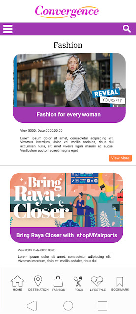
We made a wireframe draft in the Miro board.

|
|
Fig. 3.1: Wireframe 1
|
Figma Link:
Miro Board Link:


Comments
Post a Comment