Interactive Design - Exercises

27/8/2019 (Week 1)
Vun Wan Min (0334263)
Interactive Design
Exercises
LECTURE NOTES
Lecture 1
27/8/2019 (Week 1)
Mr Shamsul and Mr Lun briefed us about the module outline. They also told us about the good and bad quality in a website.
A good website should have consistency/cohesive in colour, typeface and layout, clear and good contrast, user friendly, loads fast and a hamburger button. A hamburger button is a function to toggle menu.
A bad website contains misalignment, no information, too munch information, not responsive and too much advertisement.
In the end, there is no website that is perfect. All websites have an aspects of the good and bad qualities.
Lecture 23/9/2019 (Week 2)
Mr Shamsul showed us a video about the Norman Door. It is about a poorly designed door that confuses people to give you an idea whether to push or pull. It was named after Don Norman, a professor of science and the author of The Design of Everyday Things.
After that he gave his lecture about the differences of UI and UX.
UI (User Interface) - To produce an easy, efficient, and enjoyable (user-friendly) user interface to operate a machine in the way which produces the desired result.
UX (User Experience) - To enhance user satisfactory by improving product.
Breadcrumbs: A trail of the user location in a website.
The video and the PDF of the lecture slides:
10/9/2019 (Week 3)
Web standards are rules and guidelines established by the World Wide Web. It controls the resolutions of our screen. The web standards are important for developers and visitors. When developers follow it, it make the coding easier to understand.
Lecture 4
17/9/2019
No lecture was conducted.
Lecture 5
24/9/2019
Extra Markup include ID attribute, Class attribute, Block elements and Inline elements.
ID attribute - It is used to identify the element from other elements on the page, there is no 2 same ID attributes. It also allows us to style it differently from any other instance of the same element on the page.
Class attribute - It is used to identify several elements. It can share the same value or name.
Using the 2 elements do not affect the presentation of an element.
Block elements - It always appear to start on a new line in the browser window. It is also known as block level elements. Block elements such as <h1>, <p>, <ul>, and <li>.
Inline elements - It appears on the same line as their neighbouring elements. Examples: <b>, <i>, <em>, <a> and <img>.
Lecture 6
1/10/2019
CSS Boxes Model can create border around the boxes. We can also set several properties that effect the appearance of the boxes and control the dimensions of the box. We can set the dimensions of the box, which is the width and height.
Lecture 7
8/10/2019
No lecture was conducted. Mr Shamsul and Mr Lun was looking at our layout exercise.
Lecture 8
15/10/2019
Responsive Web Design is a method to render web page resolution on different devices. It uses % (percentages) to adjust and it is a grid concept.
INSTRUCTIONS
EXERCISES
Week 1
For our exercise, we were slip into 4 groups. Each groups had to present 3 good websites and 3 bad websites. The websites that we were allowed to search from was through The Webby Awards and The Best Designs.
At first, navigating the Webby Awards' website was a bit confusing because of the layout. The layout seems to have good elements but it was hard for me to navigate it. I had a hard time looking for the websites as it did not have a clear label where it was while as The Best Designs' website was simple and easy to navigate.
The good websites:
These are the websites that our group had gathered. 4 of the websites from the bad websites were not included as it was not from the Webby Awards neither The Best Designs. We misunderstood the exercises but Mr Shamsul gave us a chance to show one of them.
The PDF version of the Excel sheet:
 |
| Fig. 1.1: https://www.webbyawards.com/ |
 |
| Fig. 1.2:https://www.thebestdesigns.com/ |
At first, navigating the Webby Awards' website was a bit confusing because of the layout. The layout seems to have good elements but it was hard for me to navigate it. I had a hard time looking for the websites as it did not have a clear label where it was while as The Best Designs' website was simple and easy to navigate.
The good websites:
 |
| Fig. 1.3: https://wpengine.com/ |
 |
| Fig. 1.4: https://www.hopewellbrewing.com/beer |
 |
| Fig. 1.5: https://clothandcompany.com/ |
 |
| Fig. 1.6: https://airtifact.heythemers.com/ |
The bad websites:
 |
| Fig. 1.7: https://airnauts.com/ |
 |
| Fig. 1.8: https://www.netted.net/guides/ |
 |
| Fig. 1.9: http://hm.dk/ |
The PDF version of the Excel sheet:
Week 2
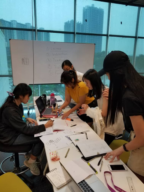
Our exercise today is to design a user interface for Taylor’s University Interactive Information Kiosk in a group. Our target audience can be parents, visitors or new students, we can also choose all the options. The goal of it is to inform the user on how to access Taylor’s University.
We started with some ideas of who we want as the audience, the scenario and what to have in the information kiosk.
In which case, we chose new students as our audiences and the scenario was that they are looking for the library. After that, we started to think up some ideas for what to put in the information kiosk.
 |
| Fig. 2.1: Draft 1 |
 |
| Fig. 2.2: Draft 2 |
 |
| Fig. 2.3: Process 1 |
 |
| Fig. 2.4: Process 2 |
 |
| Fig. 2.5: Process 3 |
The PDF version of Information Kiosk:
The video of testing the prototype:
Week 3
Landing page design
Week 4
 |
| Fig. 3.1: My picture |
 |
| Fig. 3.2: Identity V |
 |
| Fig. 3.3: B - Project |
 |
| Fig. 3.4: Ib |
 |
| Fig. 3.5: Kimetsu no Yaiba |
 |
| Fig. 3.6: Nakanohito Genome [Jikkyouchuu] |
 |
| Fig. 3.7: Show by Rock |
 |
| Fig. 3.8: Adventure Time |
 |
| Fig. 3.9: Gravity Falls |
 |
| Fig. 3.10: Steven Universe |
PDF:
Link to the website: Index
Week 5
Using Adobe Dreamweaver.
PDF:
Week 6
Information (PDF):
 |
| Fig. 4.1: Logo |
 |
| Fig. 4.2: Main Picture |
 |
| Fig. 4.3: Article 1 |
 |
| Fig. 4.4: Article 2 |
 |
| Fig. 4.5: Article 3 |
 |
| Fig. 4.6: Adobe Picture |
 |
| Fig. 5: First Attempt |
Week 7
 |
| Fig. 6.1: Second Attempt 1 |
 |
| Fig. 6.2: Second Attempt 2 |
 |
| Fig. 7: Second Design |
Link:
https://layoutexercise2019.000webhostapp.com/
REFLECTION
Experience:
After some time, I have gotten used with CSS and using Adobe DreamWeaver. However, I have gotten used with using 000webhost.
After some time, I have gotten used with CSS and using Adobe DreamWeaver. However, I have gotten used with using 000webhost.
Observation:
I observed having a wire frame is easier to code the layout you wanted.
I observed having a wire frame is easier to code the layout you wanted.
Findings:
I found that margins and leading is hard to control because of placement errors.
I found that margins and leading is hard to control because of placement errors.
Comments
Post a Comment