Interactive Design - Project 1
10/9/2019 (Week 3)
Lecture 4
17/9/2019 (Week 4)
No lecture was conducted.
Mr Shamsul and Mr Lun were giving us feedback on our landing page design.
For the social media icon, I took it from the Internet and trace it in Adobe Illustrator using the pen tool.
I drew the cloud header using the brush tool.
After placing the images, I drew the cloud button and add the menu bar, search bar and the cart button.
Week 4
After the feedback, I change the size of the layout, typeface and it's sizing.
Vun Wan Min (0334263)
Interactive Design
Project 1
LECTURE NOTES
Lecture 3
10/9/2019 (Week 3)
10/9/2019 (Week 3)
Lecture 4
17/9/2019 (Week 4)
No lecture was conducted.
Mr Shamsul and Mr Lun were giving us feedback on our landing page design.
INSTRUCTION
PROJECT 1
Week 3
After Mr Shamsul's advice, I started to look for more inspirations from Pinterest and other websites.
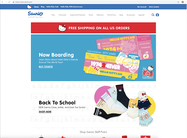
Then I find a theme for my landing page and I based it off on Cinnamoroll's cloud-like kingdom and have pastel colour scheme. I also took some images from the Sanrio Official Store (https://www.sanrio.com/), Cinnamoroll's category (https://www.sanrio.com/categories/cinnamoroll) and images from the Internet.
 |
| Fig. 1.1: Wire Frame Design 1 & 2 |
 |
| Fig. 1.2: Wire Frame Design 3 |
| Fig. 2.1: https://www.behance.net/gallery/6481989/Blue-Carrot-Boutique |
 |
| Fig. 2.2: https://www.pinterest.com/pin/334110866079496188/ |
 |
| Fig. 2.3: https://www.sanrio.com/ |
 |
| Fig. 2.4: https://www.blippo.com/cinnamoroll |
 |
| Fig. 3: Theme and Colour Scheme |
 |
| Fig. 4: Elements |
 |
| Fig. 5.1: Process of tracing Icon 1 |
 |
| Fig. 5.2: Process of tracing Icon 2 |
 |
| Fig. 5.3: Typeface (Book Antiqua) |
 |
| Fig. 6.1: Blue Background |
 |
| Fig. 6.2: Cloud Header |
 |
| Fig. 6.3: Putting Images and Margin |
 |
| Fig. 6.4: Cloud Button |
 |
| Fig. 6.5: Add Context |
Finally, I add the contexts in.
 |
| Fig. 7.1: First Attempt 1 |
 |
| Fig. 7.2: First Attempt (2) |
Week 4
 |
| Fig. 8.1: Landing Page 1 |
 |
| Fig. 8.2: Landing Page 2 |
 |
| Fig. 8.3: Typeface (Cooper Std & Cera PROMeodern) |
FEEDBACK
Week 3:
My second wire frame design is fine. But since my target audience are kids, Mr Shamsul suggested me to make my landing page in the concept of "Fun".
Week 4:
Mr Shamsul and Mr Lun said that my margin spacing is too close, they also suggest that my body text can be use as san serif and my title should be a rounded typeface and also my "Back to Top" button is too big. But overall, theme and colour are good.
REFLECTION
Experience:
Week 3: Thinking up of a call to action for a web page is not easy.
Week 4: I making a cloud theme website is fun.
Week 3: Thinking up of a call to action for a web page is not easy.
Week 4: I making a cloud theme website is fun.
Observation:
Week 3: I have observe that a landing page for kids are cute.
Week 4: I observe that rounded typefaces are suitable for kids' websites.
Week 4: I observe that rounded typefaces are suitable for kids' websites.
Findings:
Week 3: I fond that Cinnamoroll is a dog species.
Week 4: I found that I have a lot to learn about typefaces.
Designing a landing page and thinking up of a call to action are not easy. I had to look for landing page designs on the Internet and websites and I got inspired. After looking through Cinnamoroll's profile, I found out that he is a dog species and all this time I though he was a bunny because of his long ears but it does explain the tail. Rounded typefaces are much more suited for a kids' landing page. Overall, it was fun designing my own landing page for Cinnamoroll with the pastel colours and cloud theme.
FURTHER READING
9/10/2019 (Week 3)
Web Design in Easy Steps (6th Edition) by Sean McManus
The book has easy steps to follow on making a website. It has the key principles of good wed design and guide us through the process. I read the chapter on layout design and the techniques to make it attractive while having an effective navigation in my layout page.
Web Design in Easy Steps (6th Edition) by Sean McManus
 |
| Fig. 9: Web Design in Easy Steps (6th Edition) |


Comments
Post a Comment