Interactive Design - Final Project
Vun Wan Min (0334263)
Interactive Design
Final Project
LECTURE NOTES
INSTRUCTION
Final Project
Week 10
 |
| Fig. 1.1: Exchange info |
 |
| Fig. 1.2: Journal Pictures |
 |
| Fig. 1.3: Interest Pictures |
 |
| Fig. 1.4: Profile Picture |
 |
| Fig. 1.5: Colour Scheme |
 |
| Fig. 1.6: Logo |
 |
| Fig. 1.7: Header |
 |
| Fig. 1.8: Header (Larger version) |
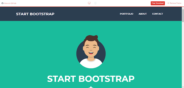
These are the Bootstrap that I used for Chan Hee's pages:
 |
| Fig. 2.1: Bootstrap 1 |
 |
| Fig. 2.2: Bootstrap 2 |
 |
| Fig. 2.3: Bootstrap 3 |
 |
| Fig. 2.4: Bootstrap 4 |
 |
| Fig. 2.5: Bootstrap 5 |
Week 11
These are elements that I drew for Chan Hee's Home page.
| Fig. 3.1: Profile Element |
| Fig. 3.2: Interest Element |
| Fi.g 3.3: Journal Element |
 |
| Fig. 4: Home Page |
Week 12
 |
| Fig. 5: W3Schools |
 |
| Fig. 6.1: About Page |
 |
| Fig. 6.2: About Page (Changes) |
I changed the bootstrap of "About" page because I found a better one, which is from Bootstrap 2 (Fig. 2.2).
 |
| Fig. 7: Journal Page |
 |
| Fig. 8: Interest Page |
 |
| Fig. 9: Contact Page |
 |
| Fig. 10.1: Back to top 1 |
 |
| Fig. 10.2: Back to top 2 |
 |
| Fig. 10.3: Back to top codes |
Link: https://codepen.io/Coding_Journey/pen/LMrLQV
I then upload it to Netlify.
The link to the website:
https://kchanhee-finalinteractive-vwm.netlify.com/
I took some screenshots and have used Adobe Photoshop the website, so we could see the full view of the images.
 |
| Fig. 11.1: Home Page (Full Image) |
 |
| Fig. 11.2: About Page Before (Full Image) |
 |
| Fig. 11.3: About Page After (Full Image) |
 |
| Fig. 11.4: Journal Page (Full Image) |
 |
| Fig. 11.5: Interest Page (Full Image) |
 |
| Fig. 11.6: Contact Page (Full) |
 |
| Fig. 12.1: Test 1 |
 |
| Fig. 13.2: Page not found |
FEEDBACK
REFLECTION
Experience:
After more coding with bootstraps and CSS, I have gotten used to it now. Coding with it was more easier but having errors were still hard to change.
Observation:
I observed that using Netlify for web hosting is much more easier than 000webhost because deploying the web pages were easier. However, it is hard to navigate because I have have not understand to setting and how the navigation works.
Findings:
I found that my friend that I am making a website for has gone to a lot of fun places and has a lot to write. Making a website for her was fun and challenging in it's own way because I get to explore more bootstraps and codes that I never used before.
REFERENCE
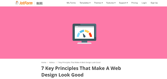
7 Keys Principles That Make A Web Design Look Good by JotForm
 |
| Fig. 14: 7 Keys Principles That Make A Web Design Look Good |
It has examples and references that was well explained and easy to understand. It explains how to make a good layout and have good colour schemes.
The 7 key principles that make a web design look good:
1. Keep your design balanced.
The 7 key principles that make a web design look good:
1. Keep your design balanced.
- Ensure that design does not tip to one side or the other.
2. Compartmentalize your design by using grids.
2. Compartmentalize your design by using grids.
- Grid is closely related to balance, it consists of vertical and horizontal rulers. Column helps improve readability and making the content easier to absorb.
3. Pick two or three base colors at most for your design.
3. Pick two or three base colors at most for your design.
- Some colors go well together and some don’t. Picking the right colour scheme is important to send out the right messages.
4. Try to make the graphics go well together.
4. Try to make the graphics go well together.
- Graphic elements can add visual messages to a wed design.
5. Improve your website’s typography.
5. Improve your website’s typography.
- Font Stacks: Basic CSS code for typefaces.
- Measure and Leading: The height and length of boxes and letters.
- Hanging quotes and bullets: To improve readability and does not disturb the flow of text.
- Print rules that do not apply: Printed is fixed by columns, rows and point size while the web is not.
- A word about image replacement: Images are better to be in header rather body text.
6. Make elements stand out by adding white space around them.
6. Make elements stand out by adding white space around them.
- Negative spaces give more breathing room and make text more readable.
7. Have all elements connected.
7. Have all elements connected.
- Having consistency

Comments
Post a Comment